2019 is underway and the design industry is clearly crushing on Living Coral, Pantone’s Color of the Year. It’s soft yet lively. Bold yet comforting. No wonder everyone’s in love with Living Coral. So, just how do you incorporate this peachy keen hue into hospitality spaces? InspireDesign tapped a few experts to share how this expressive color can truly transform a space.
“It’s a safe option. In a time when our world is filled with anger and conflict, the color is cool and calming. It doesn’t promote controversy, debate or discourse; it is truly safe.” —David Shove-Brown, partner, //3877
“It’s energizing and refreshing! We had started adding pops of coral and chili pepper recently in our schemes as an accent. It adds a natural brightness. Because the color has a hint of a warm orange tone, it’s made more palatable and mixes well with many colors. It’s less specific as just a pink alone.” —Lesley Hughes Wyman, principal, MatchLine Design Group
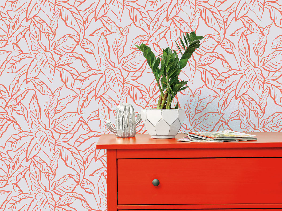
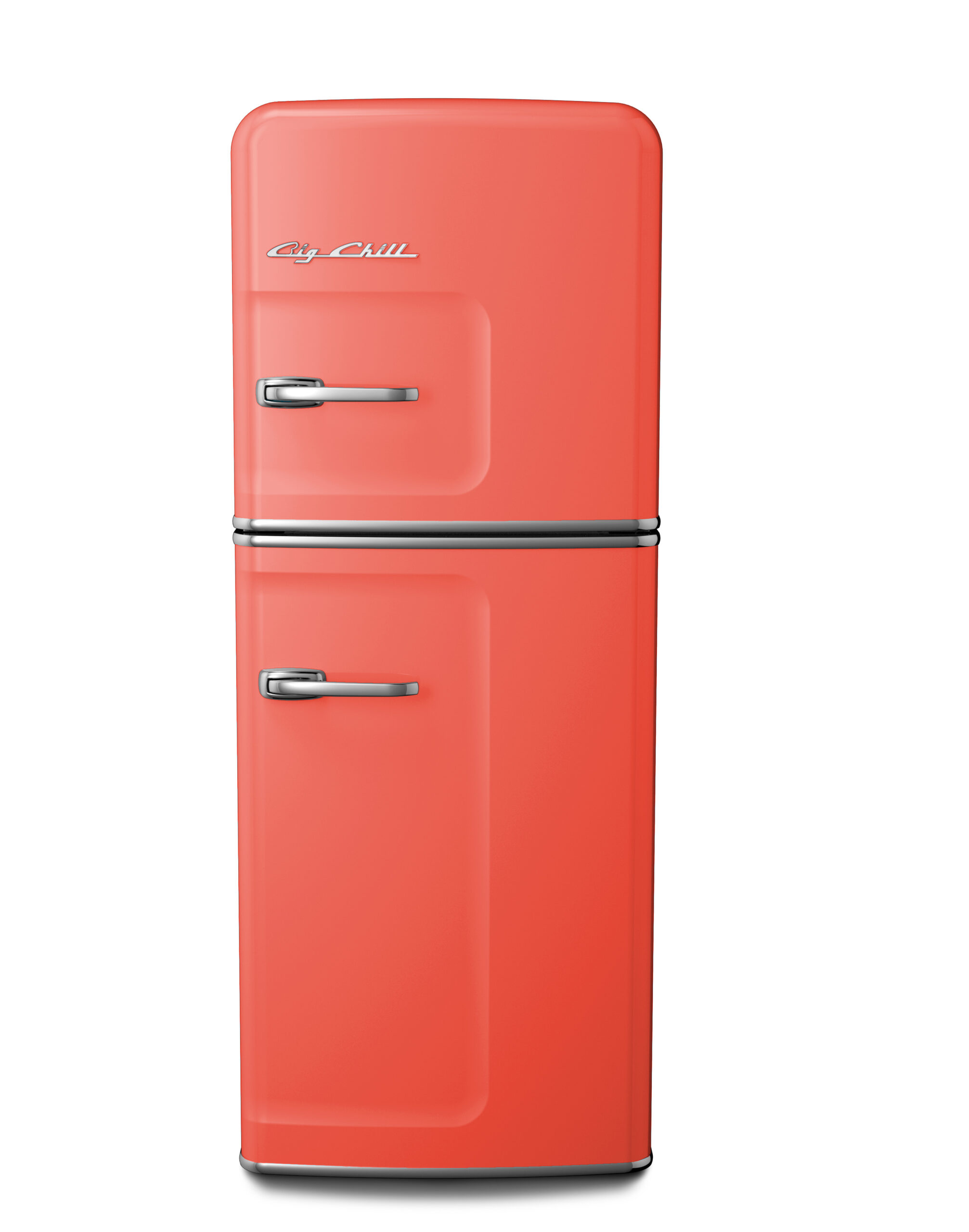
“Infusing a pop of color into a hotel room or guest-facing space such as a café or lobby through an accessory, like a microwave, is a fun, unexpected way to incorporate a bright color in a tasteful way. Since bright colors tend to look best when balanced with softer neutrals, pairing this year’s selection with a subtler palette is the best way to achieve a balanced look within a given space.”
—Orion Creamer, founder of Big Chill
“Living Coral is such a vibrant and fun shade, and it works so well with different colors. This trending color contrasts nicely with neutral tones and moody shades for interior spaces.” —Lela Richardson, senior project designer, Wilson Associates’ Dallas studio
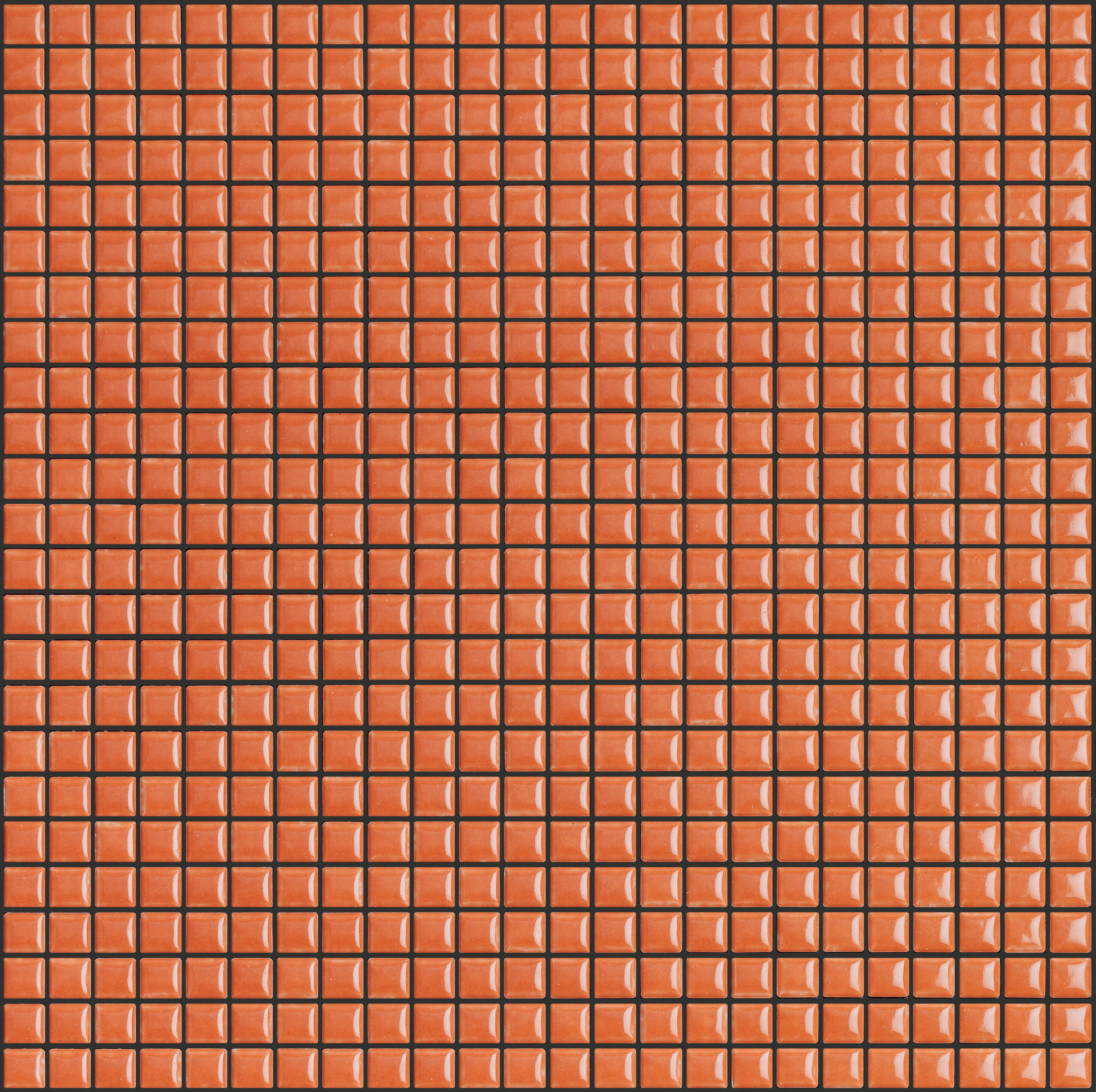
“Incorporating the color of the year is always about applying color sensibility, especially within the hospitality sphere; the color applied has to not only be livable but has to have longevity in its design. Living Coral, similar to previous years’ selections, is indicative of what color schemes will be popular across the industry, moving the needle toward cool or warm tones depending. In this case, Living Coral points to a return of warmer color palettes, jewel tones and golden accents. For hospitality spaces, I recommend using this color, or similar tones of pink and orange as an accent. Tile is a great way to achieve this.” —Katie Michael-Battaglia, design director, Nemo Tile + Stone
“I love Living Coral because it brings me a sense of nostalgia. I grew up in the 1980s so it reminds me of those types of flexible, softer colors. I enjoy incorporating warmer finishes like coral into the spaces I design. Maybe I’m biased, but it does bring back a lot of childhood memories, and I think it’s important to keep a sense of playfulness, even as a grown-up!” —Justin Colombik, studio director, Puccini Group
“I love how optimistic this color is for interiors. Beyond the accent wall, it is easy to infuse Living Coral into a space with accessories, such as lampshades, wall art, pillows and throws. You can even take this a step further by integrating a colorful area rug to give the room dimension from the ground up.” —Jennifer Matthews, co-founder and creative director, Tempaper
