Visit Carlsbad, in partnership with the Pantone Color Institute and quantitative influencer marketing platform Fohr, has unveiled the results of the 2019 Colors of Travel Study, which identifies trending colors used in inspirational travel photos across social media and the color psychology that inform these themes.
The study revealed this year’s trending Colors of Travel:
Pantone 16-1522 Rose Dawn
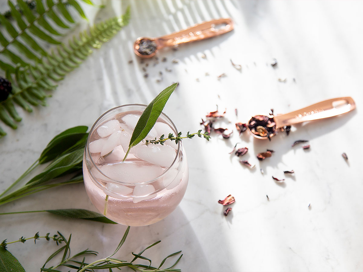
 A muted and dusted pink hue supported by a grounding brown undertone, Rose Dawn is a color associated with the natural glow of health. Whether appearing in the wondrous sunrise that marks the beginning of the day or presenting a soft and subtle contrast within vibrant flower fields, this warming rose tone appeals to the persisting desire for unpretentious and untreated organic color. “Pantone 16-1522 is a gentle rose tone reflective of our desire for warm and inviting color that is natural, organic and approachable,” Laurie Pressman, VP, Pantone Color Institute, told InspireDesign.
Pantone 15-4323 Ethereal Blue
Inherently connected to a clear and cloudless blue sky, Ethereal Blue conjures up visions of endless opportunities for 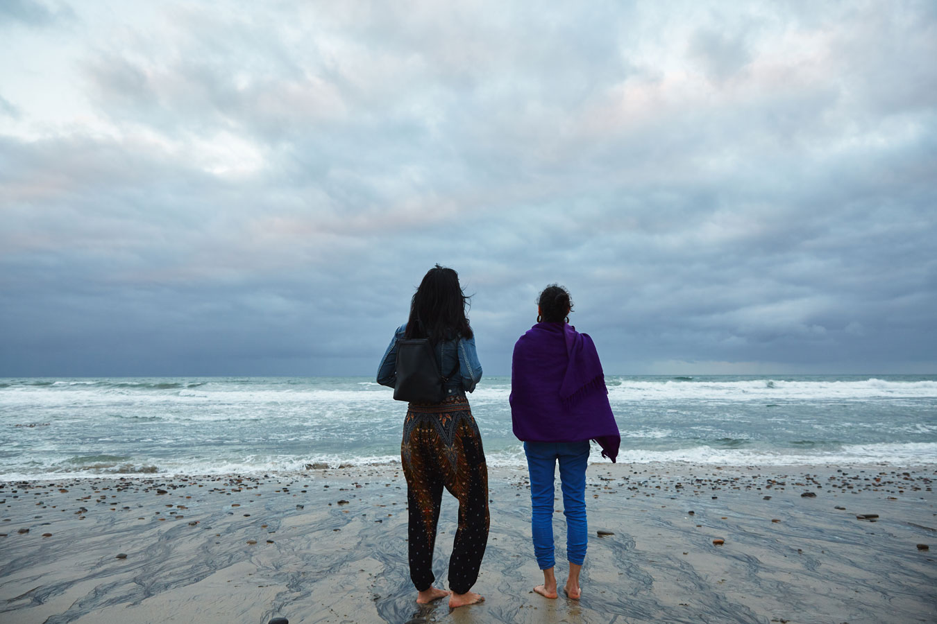 outdoor recreation and relaxing wellness retreats. A daily presence, Ethereal Blue’s constancy instills us with calm and contentment, bringing a sense of peace and tranquility to the human spirit and inspiring feelings of unfettered freedom, escapism and the desire to run and play. “Evocative of the boundlessness of the sky above, Pantone 15-4323 Ethereal Blue inspires us with thoughts of endless freedom and, at the same time, because it is tied to something we look up and see every day, conveys a message of dependency and constancy, filling us with thoughts of contentment,” said Pressman.
Pantone 19-4535 Ocean Depths
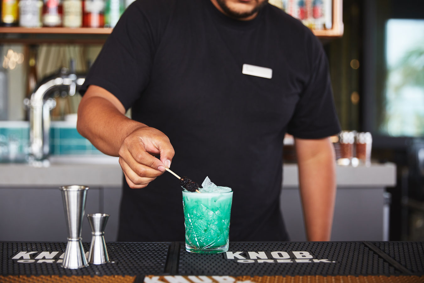 Speaking to our ongoing love affair with sea waters and water-related activity, Ocean Depths is a complex fusion of green and blue reminiscent of the color of the sea, coastal shorelines and the watery paradise of deep lagoons. Combining the loyalty, wisdom and calming qualities of blue with the soothing, healing and compassionate qualities—both to mind and body—ascribed to green, Ocean Depths suggests a spirit of connectedness and evokes feelings of laid-back sophistication and modern glamour. “A marriage of the calming qualities of blue with the soothing and healing characteristics of green, the complex teal green Pantone 19-4535 Ocean Depths highlights our affinity for cool and refreshing sea waters,” she said.
Pantone 16-0948 Harvest Gold
Emblematic of autumn’s yellow florals, spectacular sunsets and idyllic sandy beaches, Harvest Gold is a primitive shade that connects us with the passing of the seasons and the beauty and splendor found within the habitat of our natural world. Savory and spicy, a golden yellow striking in appearance, Harvest Gold is equally suggestive of exotic culinary surprises. Illuminating without overly heating, we bask in the glow of this warmly lit solarized shade. “A rich autumnal golden shade, Pantone 16-0948 Harvest Gold brings to mind the richness of our natural world as the seasons turn, temptingly exotic culinary delights and the spirit of heritage,” said Pressman.
“From the open and expansive blue sky that conjures up endless opportunities for outdoor recreation and the soothing deep teal lagoon waters, to the savory and spicy golden yellow suggestive of exotic culinary surprises, and warming rose tone of the wondrous sunrise, this year’s colors highlighted in the 2019 Colors of Travel Study bring to life the unique beauty of Carlsbad’s natural surroundings and wellness-oriented lifestyle,” she said. “Calming and comforting, yet at the same time inspiring our imagination and containing a touch of the exotic, it’s a palette of color that expresses our desire to engage, connect, and experience—not only with nature and with others, but also with ourselves.”
To create the 2019 Colors of Travel study, Fohr selected 75 influencers with an Instagram following of 50,000 or greater and their five most engaged Instagram photos. These images were analyzed to determine the four most common colors.
“Color has always been a part of why we travel,” said Grace Murray, VP, Fohr. “The desire to ‘see’ a new place is rooted in a mental image we’ve already conjured: We are drawn to land and cityscapes that look drastically different to our own. Instagram’s influence over people’s travel decisions is incredibly dominant. Using a quantitative analysis approach, we discovered that the current trending, appealing and engaging hues in inspiration travel photos are much more grounded, calming and muted compared to the vibrant hues from a similar study last year.”
Informed by the 2019 Colors of Travel study, Visit Carlsbad and Pantone developed the second annual Colors of Carlsbad palette to showcase how these individual trending colors come to life to form a cohesive palette in Carlsbad, CA. Distinct from last year’s results, 2019’s palette reflects grounded, earthy and calming hues that are emblematic of Carlsbad’s deep-rooted dedication to wellness, serene outdoor sights, recreational opportunities, and wholesome approach to culinary creativity. This year’s primary hues can be discovered all throughout the “Village by the Sea” from its warming rose sunrises and airy expansive blue skies, to its soothing green-blue lagoon waters and golden yellow florals and culinary experiences.