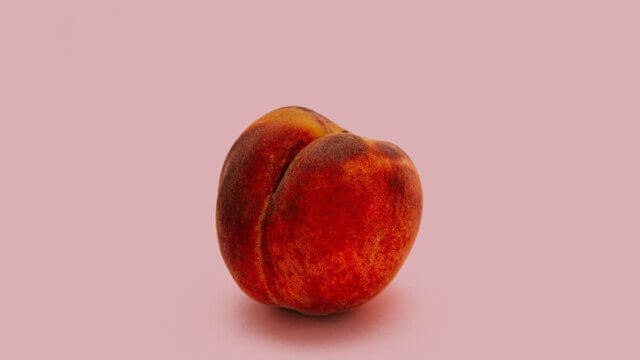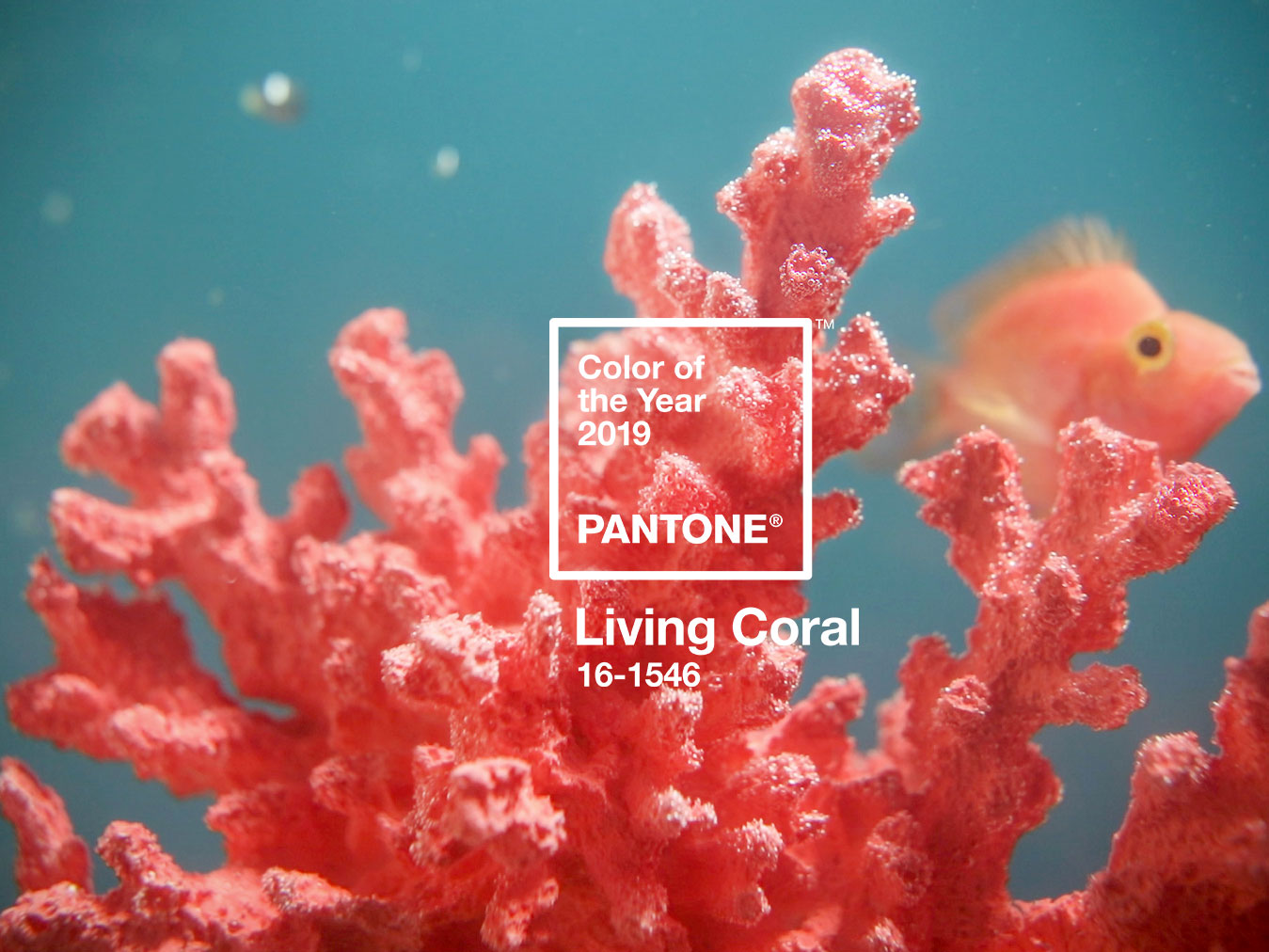
Style watchers and designers, rejoice! The 2019 Pantone Color of the Year: Living Coral (PANTONE 16-1546), an animating and life-affirming coral hue with a golden undertone that energizes and enlivens with a softer edge.
“Color is an equalizing lens through which we experience our natural and digital realities, and this is particularly true for Living Coral,” said Leatrice Eiseman, executive director of the Pantone Color Institute, in a statement.
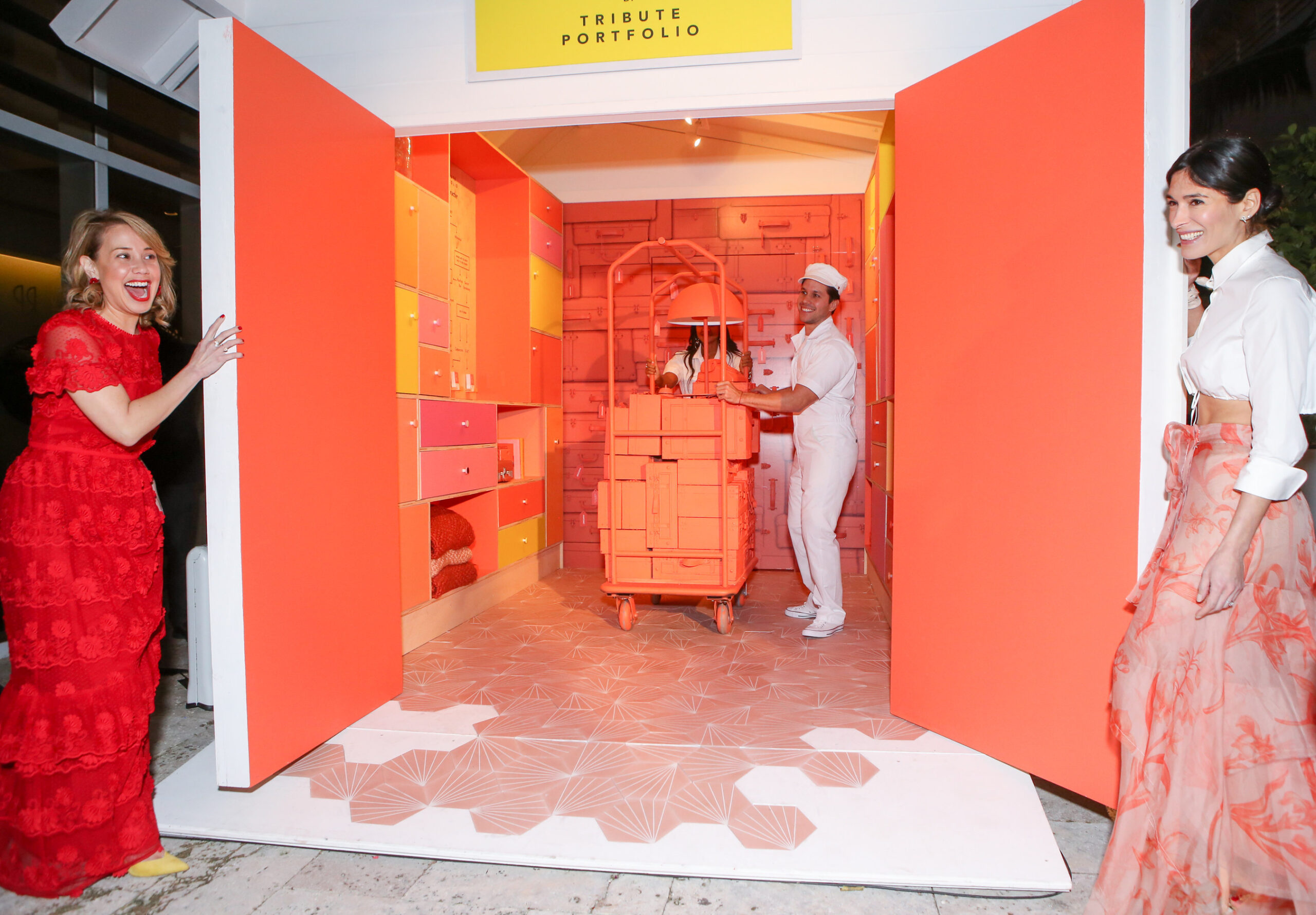
In addition to unveiling this peachy keen hue, Pantone has entered into a partnership with Marriott International’s Tribute Portfolio to introduce a series of experiential pop-ups that celebrate the power of color and the pursuit of travel to inspire creativity and connect communities.
Aptly named for its communal nature and colorful design, the Pantone Pantry by Tribute Portfolio will debut at Art Basel in Miami Beach at the Royal Palm South Beach Miami Resort and will travel to new Tribute Portfolio hotels next year.
Each Pantone Pantry by Tribute Portfolio will take guests on a whimsical journey of color and captivating design, using different mediums to bring the travel-inspired installations to life and to playfully highlight the 2019 Pantone Color of the Year palettes. Artful, unexpected and designed to reflect the character of its host city, each pantry will be created collaboratively with a cast of colorful characters, artists and influencers, who have a distinctive perspective on travel.
“We are thrilled to partner with Pantone, who is as passionate and colorful as we are,” said Amanda Nichols, global brand director, Tribute Portfolio. “With 28 hotels open and growing, Tribute Portfolio has struck a chord with those who seek out independent experiences and crave a connection with the community when traveling. With Tribute Portfolio’s knack for igniting imaginations through travel and Pantone’s ability to inspire through color, these quirky pop-up experiences are sure to encourage a fresh perspective for guests and locals alike.”
Sociable and spirited, Living Coral embodies the desire for playful expression and symbolizes the innate need for optimism and joyful pursuits, including travel, which has the ability to enable shared experiences and social connection.
“Like travel, color enhances and influences the way we experience the world,” said Laurie Pressman, VP of the Pantone Color Institute. “Linked to tactility and human connection, PANTONE 16-1546 Living Coral is a warm and welcoming shade that fosters immersive experiences and encourages playful expression; so it made perfect sense that we partner with Tribute Portfolio, a brand that shines a light on the individualized and personalized spirit of all its characterful hotels, to create a unique way to experience color and bring PANTONE 16-1546 Living Coral to life.”