After a year of stay-at-home orders and too few IRL (in-real-life) moments in 2020, homeowners, designers, architects and facility managers are craving authenticity, nature and meaningful human interaction after living in a mostly digital world.
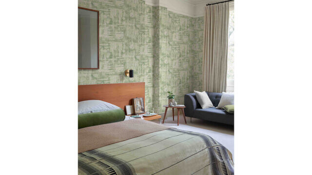
To match that craving, PPG has introduced its 2022 Color of the Year: Olive Sprig, what it calls an elegant, grounded, versatile and highly adaptable gray-green.

“Green is the rising trend in the design market, hands down,” Amy Donato, senior color marketing manager, PPG paint told InspireDesign. “Our global color forecast team saw it everywhere. It was the easy answer to our color of the year.”
Olive Sprig is a relaxed but enticing green that emulates the feeling of soothing aloe vera or a fragrant plant—brightening any space with organic liveliness. A versatile color that lives well inside or outside, Olive Sprig blends in with nearly any environment. “This particular shade is very special,” she said. “That is because it is so incredibly versatile. It is really usable.”
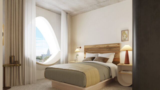
Lending itself to be paired with natural materials, Olive Sprig looks beautiful alongside unique architectural elements and furniture with curved forms to create a comfortable and grounded space, she said. The color can help create a sanctuary in a bedroom, encourage focus in an office, offer the perfect neutral backdrop in a retail or restaurant and create a grounded getaway in hotels.
Olive Sprig also pairs beautifully with brass accents and wood tones on an island or lower kitchen cabinets. Homeowners, designers, architects and other customers of professional painters can also gather inspiration from this color through the use of floor-to-ceiling emerald tiles in a bathroom, incorporating a luxe velvet green couch in the living room, or immersing the home in plants in a variety of shapes, colors and sizes.
As part of PPG’s annual Global Color Forecasting Workshop, the company’s experts uncovered that consumers are more inclined to adopt more colorful selections after difficult inflection points throughout history, often seen during the Roaring Twenties or after the Great Depression. As part of this cyclical history, Donato reported seeing post-pandemic optimism infiltrating commercial and residential design spaces so many can create a sense of escapism.
Resilience, the need for connection and inspiration from nature were recurring themes at PPG’s Global Color Forecasting Workshop. This annual event brings together more than 30 PPG global color stylists from the automotive, consumer electronics, aerospace and home paint and stain industries. Over the course of several days, the stylists analyze the runway, lifestyles, demographics, geographies, global events and cross-cultural societal inspirations to determine what colors will resonate and represent the PPG global color forecast, including the PPG 2022 Color of the Year.
Under the theme Horizon, which represents our current state of hope, reflection and new beginnings in the post-pandemic era, PPG’s color experts identified three color stories that will resonate for homeowners, designers, architects and facility and property maintenance managers in 2022:
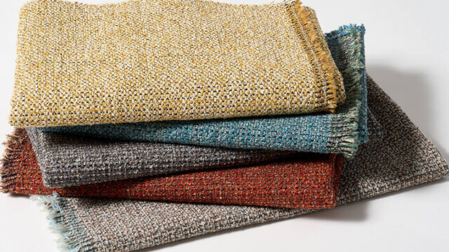
- Invaluable: The Invaluable palette culminates a rich library of cultural references to imagine its perfect place in today’s world. Drawing Gatsby-esque inspiration from the past to create the go-to glamorous palette of the present, this color story is not afraid to be bold. Grounded with rich hues like PPG’s Gooseberry, Castle Stone and Ancient Copper, the Invaluable palette adds depth and warmth to any space. Pair these colors with rich, dark woods and brass accents to really turn up the drama—especially in the home, restaurants or hotels.
- Introspective: The Introspective color story is for those who prioritize self-care and appreciate life’s simple pleasures. Create a serene and intimate space with colors like PPG’s Tea Time, Peace, Silver Service and Pine Whisper, which complement the soothing comfort of Olive Sprig. These hues are perfect for the private yet soulful consumer looking to create an ethereal bedroom retreat, a thoughtful office space or add a hint of color to an otherwise neutral-toned kitchen.
- Inspired: Those drawn to the Inspired color palette cannot be pinned down. These mood-boosting shades are sure to turn up the volume in any space and add an optimistic jolt of energy for spaces that need it most—like a statement-making front door, a unique retail environment or an inspiring child’s playroom. PPG’s Cenote, Aloha and Lettuce Alone offer liveliness and mimic high-tech greens and blues that are sure to turn heads. Warm hues like Paris Pink, Coral Silk and Crushed Pineapple are perfect picks for the confident, social and adventurous painter who wants to spread joy, embrace change and break free from minimalist designs of years past. PPG’s Olive Sprig acts as a muted neutral in this palette to ground the bolder, brighter color counterparts.