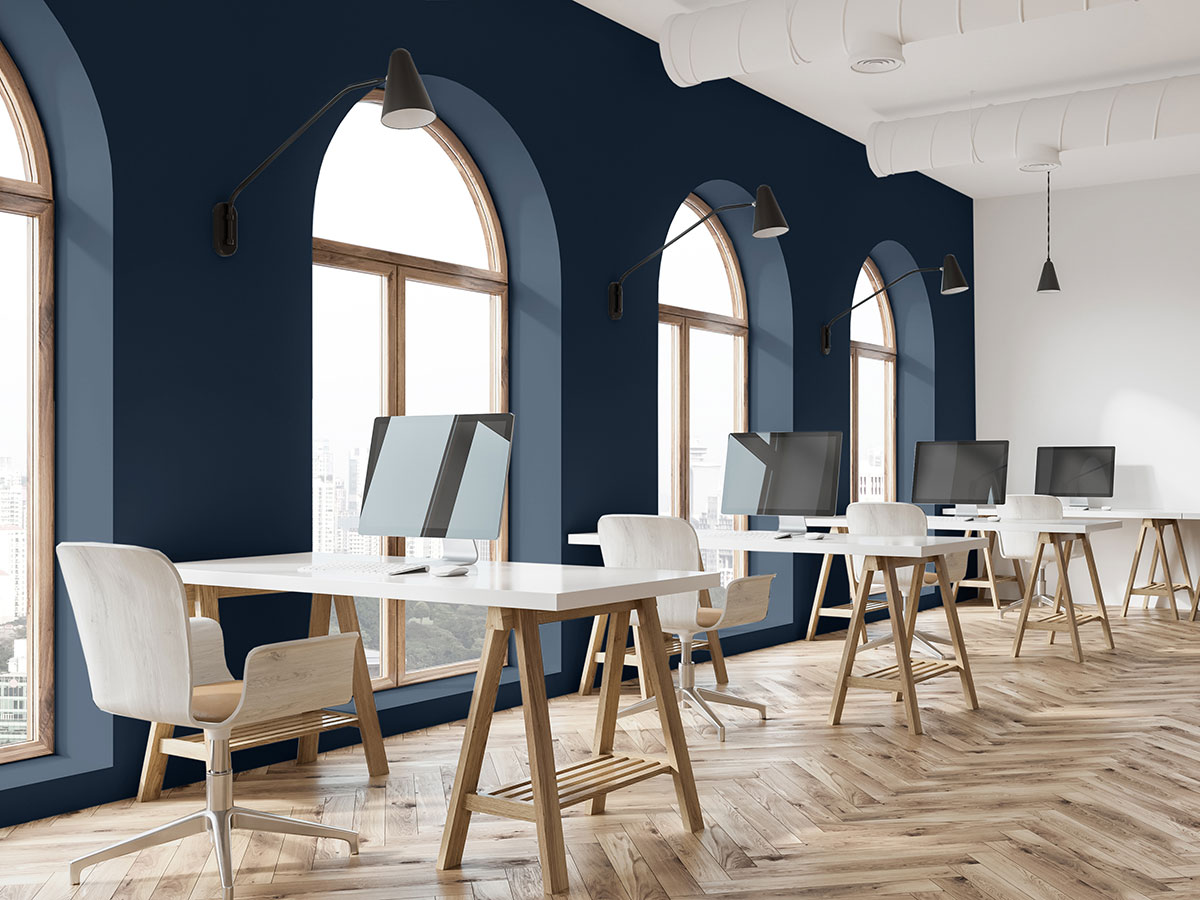
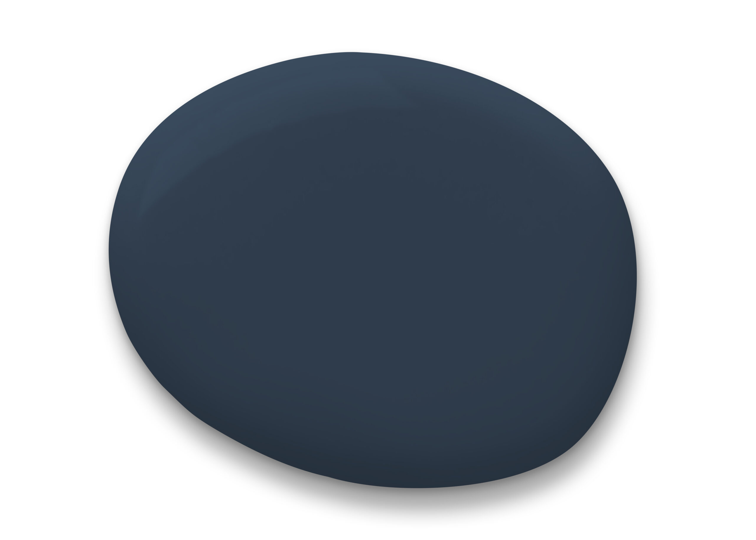
Sherwin-Williams has revealed the 2020 Color of the Year: Naval SW 6244, a rich navy hue that strikes a balance between calm and confident. Naval is where the glamour of Art Deco meets the serenity of a yoga studio, pairing the contemporary desire to practice of self-care.
For more inspiration, check out InspireDesign’s navy-inspired mood board here.
“The use of color in interior design is changing. It’s not just about what a space looks like anymore, but how it makes you feel,” said Sue Wadden, director of color marketing at Sherwin-Williams. “People want to feel grounded and inspired to pursue their mental, physical and emotional well-being. Naval is reminiscent of the night sky, which people have looked to for centuries for guidance, as a muse and as a reminder to live more mindfully.”
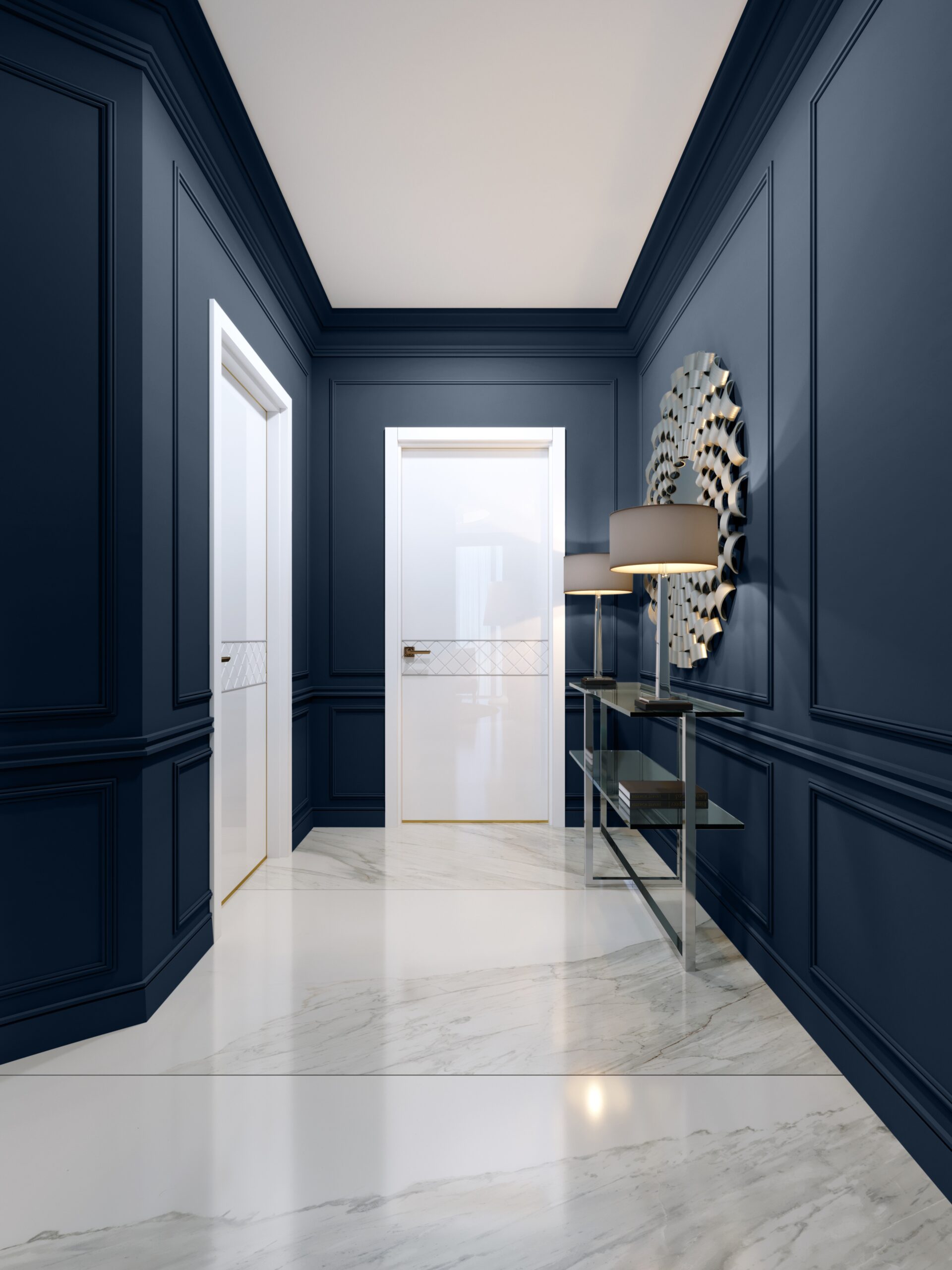
Taking cues from the Roaring 1920s, Naval pairs well with luxurious finishes, such as marble and mixed metallics, and can help highlight items of exquisite craftsmanship. Designers and homeowners alike are embracing statement-making décor, and Naval is the new, approachable neutral that goes with everything.
“We’re predicting that the next decade in color is going to be bold. This year we saw the return of the ‘70s, and next year we think the vibrant energy and luxurious design of speakeasies will make a comeback,” said Wadden. “Naval merges the desire for rich, inspiring color with our yearning for relaxation and retreat. In the next 10 years, we’ll continue to move away from omnipresent neutrals and design will feel more personal again.”
Naval is inherently forward-looking as the chosen bold hue to kick off the decade, but the color has a long-established presence in nature. Naval’s deep, sapphire-like quality is reminiscent of the night sky and deep sea, and this nautical influence makes it well-suited for use with natural textiles and coastal inspired décor, which are growing in popularity.
“Naval can easily play into any mood you’re trying to create, whether it’s lively energy for a restaurant,
or calm serenity in a hotel room,” said Wadden. “It’s a truly versatile color that will be on-trend and
appealing for years to come.”
Designers Weigh In on This Color of the Year
Sherwin Williams’ Naval SW 6244 has already captured the attention of hospitality designers, who are inspired by this calming hue and the plethora of opportunities to use the color in a variety of spaces.
“Naval’s color and hue elicits a sense of being grounded. The deepness of the tone, coupled with the restfulness of the blue, recalls elements found in nature —such as the night sky or the deep ocean,” said Lela Richardson, senior project designer, Wilson Associates. “Naval provides several opportunities in the interior. This color offers a cue to wellness design, brought to life through accents, focal walls, and in select areas entire rooms. Naval can be easily used as a balanced, foundational hue –– especially when paired with a strong, bright colors that seek to invigorate a space.”
“It’s exciting to see bold colors that also serve as neutrals coming to the forefront of design again. The shade of Naval is slightly different from the Navy that was popular in the early 80s. I remember the Navy of the 80s as brighter, and Naval has a deeper undertone which creates a pleasing backdrop for other colors. Used in today’s interiors it feels new and fresh again,” said Carla Niemann, SVP of design & architecture, Premier Project Management.
“While we’ve been using navy shades for a while now, the deeply hued Naval has a sophistication to it,” said Lesley Hughes Wyman, principal, MatchLine Design Group. “The tone makes for a more palatable high-contrast instead of black and we consider it a new neutral. Naval makes for a great backdrop to saturated accents like fern green, bright paprika and warm cognac colors.”
“Sherwin Williams’ Naval is a beautiful, deep tone of blue that does indeed evoke a sense of calm and relaxation,” said Terry Eaton, president/chief curator, Eaton Fine Art. “When collaborating on an art program for one of our clients, Eaton Fine Art tends to curate based upon clients’ locations, desired narrative, and the design of the existing spaces. What’s so inspiring to me about this particular color is that it can easily work in any of these situations, in a variety of spaces, putting a hotel guest at ease no matter how strenuous their journey.”
“Naval, in combination with different lighting levels, can trigger a variety of emotions in a space, yet the underlying and consistent descriptor in a room that uses Naval as the primary color is one that is calm and grounded, not a space that is high energy.
“Combined with natural daylight and whites/creams, Naval creates a space that is very fresh and tranquil. However, when Naval is combined with a lower light level that is dark and dramatic, dark woods and fabrics, it creates a space that feels both moody and peaceful at the same time.”
“For private areas such as guestrooms, our clients have gravitated to those spaces that create a place of respite for the mind, body and soul. A room with Naval as its primary color will inevitably contribute to this sense of tranquility.”