Much like Pantone’s rationale for choosing its 2021 Color of the Year, Curator, a paint brand originating from Ireland, developed its palette to channel the feeling and story of Ireland’s culture. Curator features a palette of 144 colors, developed in collaboration with 29 Irish artisans, jewelers and designers.
“Curator’s current palette has been with the brand since its launch, but with Pantone announcing ‘Illuminating’ and ‘Ultimate Gray’ as their 2021 Colors of the Year, we wanted to use that as an opportunity to share our brand and colors,” said Garry Cohn, interior design expert, Curator. “Much like Pantone’s selection, our colors also tell a story of living and the ethos of a community… The 144-color palette is self-sufficient to adapt to any style or trend that may evolve in the future. Our approach to good design is not one color defining a period in time but instead, a combination of colors that creates various palettes that reflect your moods and aspirations.”
According to Cohn, Curator went beyond merely looking at the shades of colors, but selecting ones that closely aligned with Pantone’s choices.
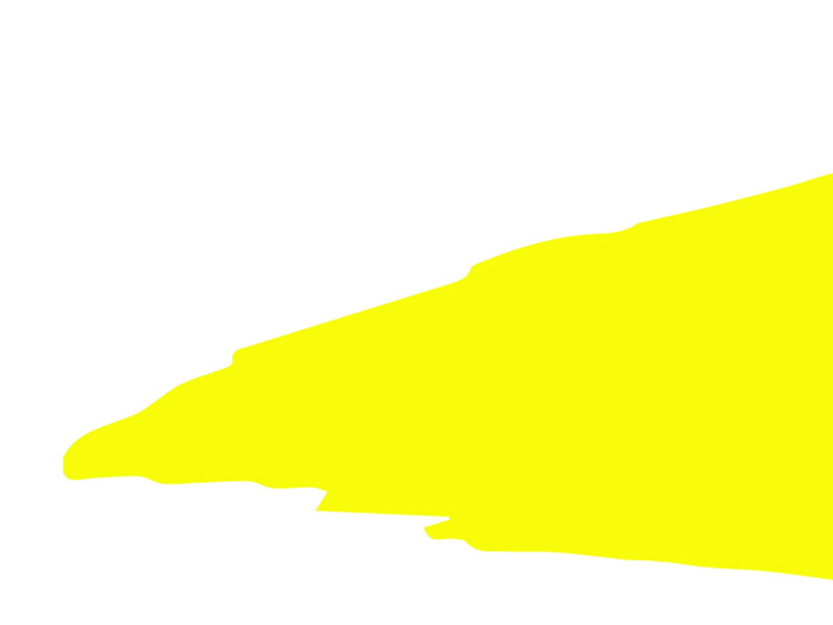
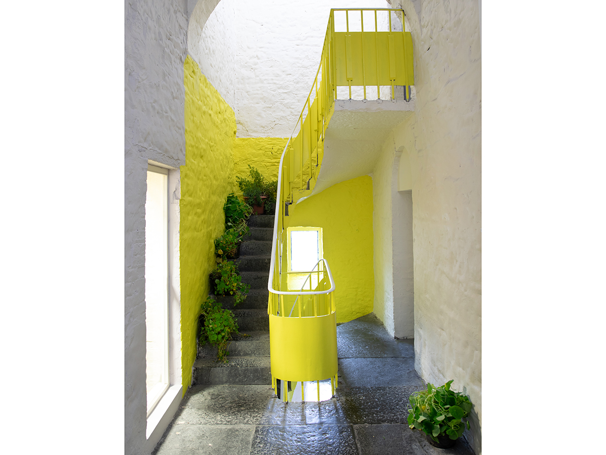
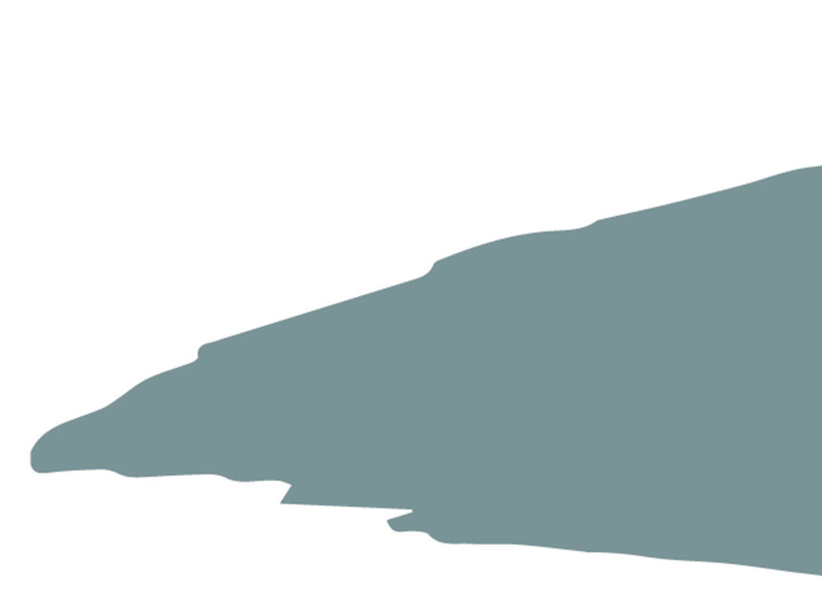
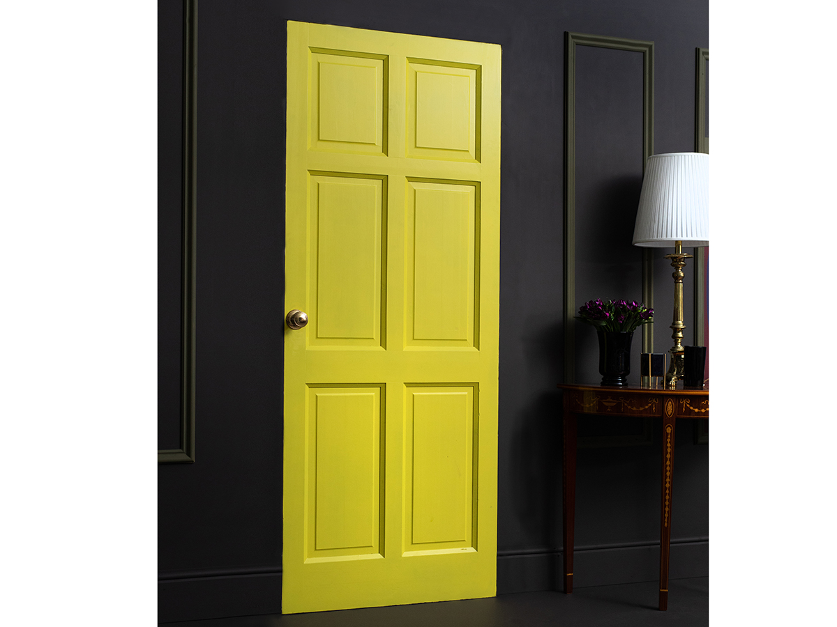
‘Optimist,’ a bright shade of yellow brings the ability to uplift and inspire, communicating the same level of emotion as Pantone’s ‘Illuminating.’ Meanwhile, Pantone’s ‘Ultimate Gray’ is meant to present a feeling of solidness, dependability and reassurance. Curator’s ‘Broken Slate,’ a leaden hue of gray, takes root from the slates of stately homes or ruins of castles across the Irish landscape. “It again re-emphasizes that feeling of assuredness and security that Pantone’s ‘Ultimate Gray’ emulates, especially against the backdrop of all the uncertainty going on around us,” Cohn said.
He continued, “Ireland’s landscape is one of the most alluring, beautiful places in the world. From the rugged coastline, rolling hills, to the fields of flowers and even the wild, storms on the beach, the Irish landscape channels the entire gamete of feeling and emotion. This landscape is so inspiring during this unprecedented time.”
Cohn believes that the industry will see a greater emphasis on careful implementation of bold colors. “With Pantone’s 2021 Colors of the Year announcement, we’re seeing a duality in what people are looking for,” he said. “People want feelings of security, a turn to those grays and neutrals, while also looking to bright colors to help propel that feeling of escapism.”
He added, “More than ever, hospitality is a place to escape from your everyday life into a fantasy world of another life you could live. There are two things that people are looking for when they go away and that is a unique and memorable experience and confidence that they will be safe in this environment.”
The Curator team traveled across Ireland sourcing and collaborating with the Irish designers and artisans—from potters and milliners to jewelers and fashion designers—to produce the curated palette. Each color tells a tale of living, working and creating in Ireland, Cohn said.
“Curator believes a home should have colors that reflect a soul and a story of something unique to them. That is why each of the colors are unique and personal to Ireland and its expressive design community. Each designer has a color that means something special to them and unlocks the natural world around them,” he said.
One way to bring the sense of the outdoors in—in a way that people can control—Cohn said, is by changing up spaces. Since the COVID outbreak, Curator has seen a significant uptick in the sales of green paint hues by about 59%, Cohn said, noting that shades of green evoke a sense of nature and the outdoors while also providing a sense of cleanliness to a space.
Much like the Irish landscape, there isn’t a rainbow without a little rain, providing hope that brighter days are ahead for hospitality.
“You can have a gray, rainy day one minute and the next, a cloud separates, a beam of sunlight shines down forming a rainbow in front of your eyes with the most intense colors that you could ever imagine,” Cohn said. “This is our palette, beautiful neutrals complemented by deep impactful colors and everything in between.”